


This infographic explores meat consumption patterns, nutritional values, and pricing trends in India through vibrant illustrations and engaging visuals. Specifically designed for children, it simplifies complex information into fun facts and easy to understand graphics. Perfect for educational settings like classrooms or children’s magazines, the project aims to make learning about food choices informative and entertaining.
I chose to make this infographic about meat because most people who eat meat are unaware of where it comes from or the details about the meat they consume. I believe that understanding food sources is important, not just for making informed choices but also out of respect for the animals involved. By introducing this awareness at a young age, I hope to spark curiosity and interest in children, encouraging them to learn more about the food they eat.


In today’s world, where food is often disconnected from its origins, it’s essential to create awareness about where our food comes from. This infographic simplifies complex data into bite-sized, enjoyable content, making it easier for children to understand the nutritional and ethical aspects of meat consumption. It’s designed to inspire curiosity and build a more conscious relationship with food.


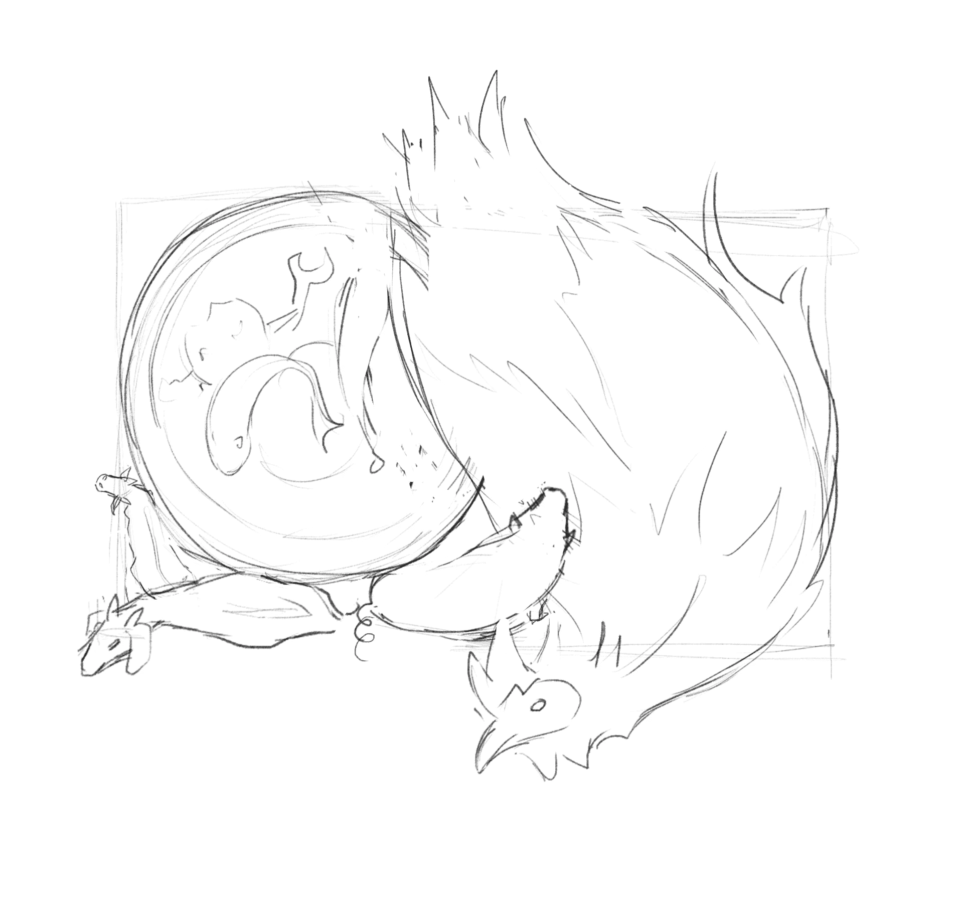
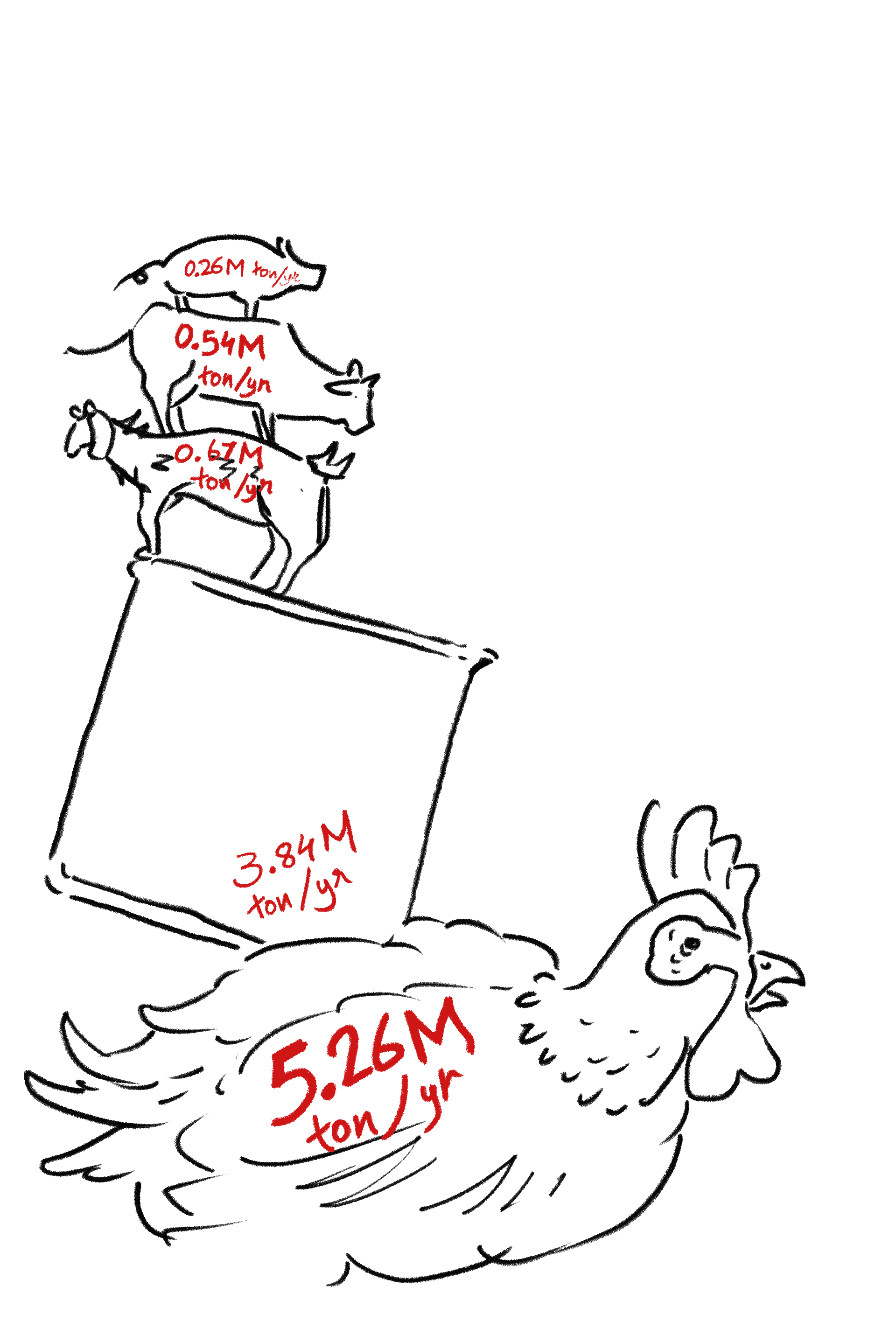
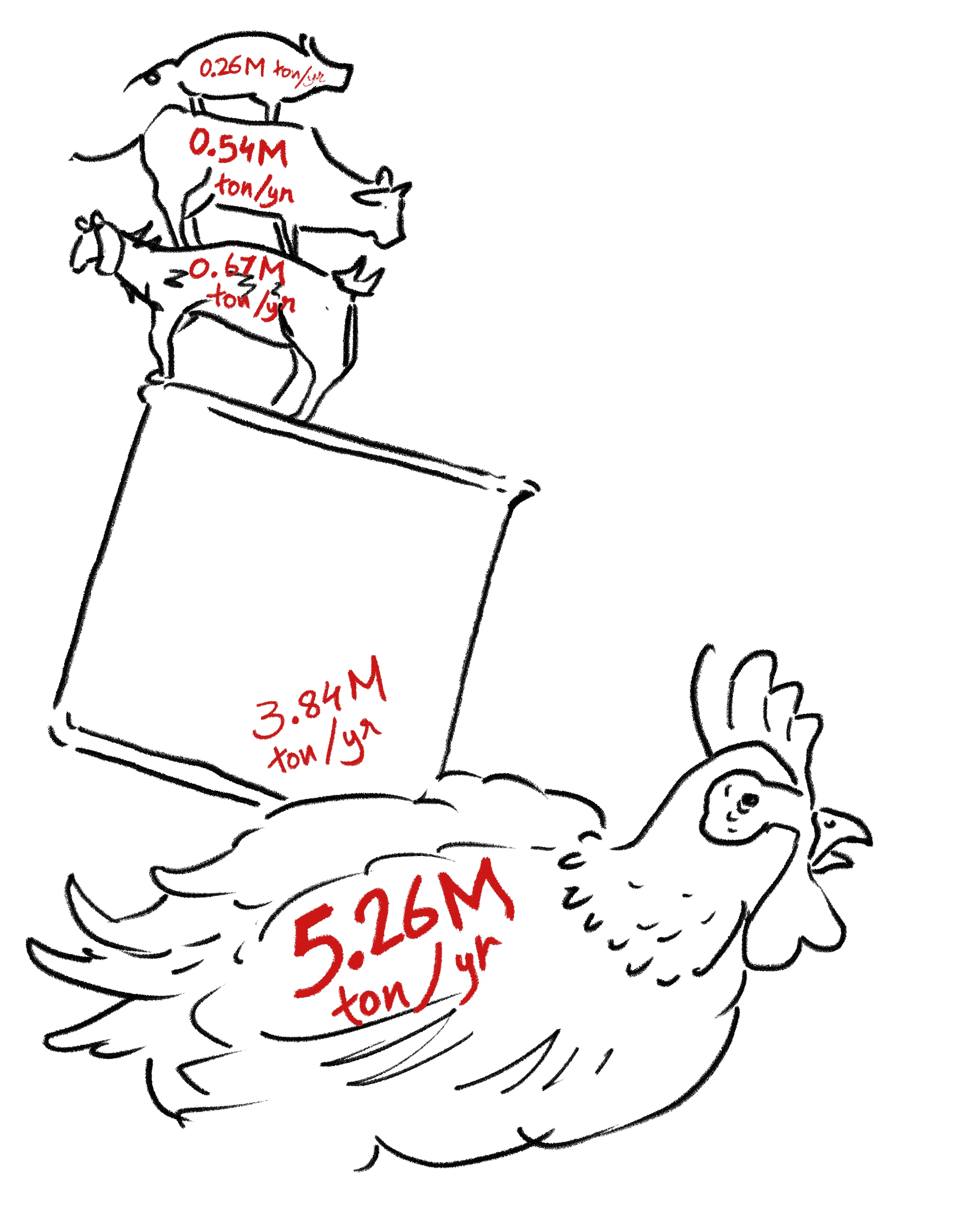
Final Sketch…
Hover over the image
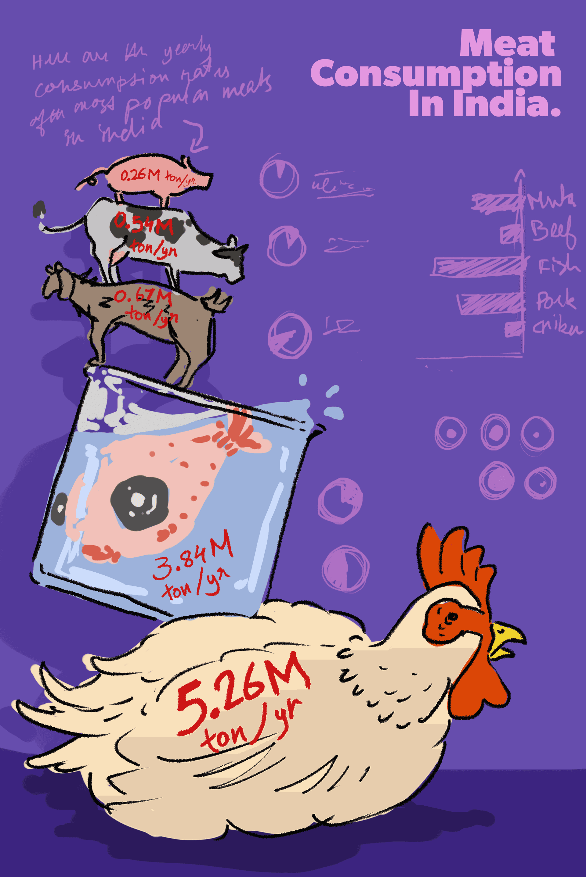
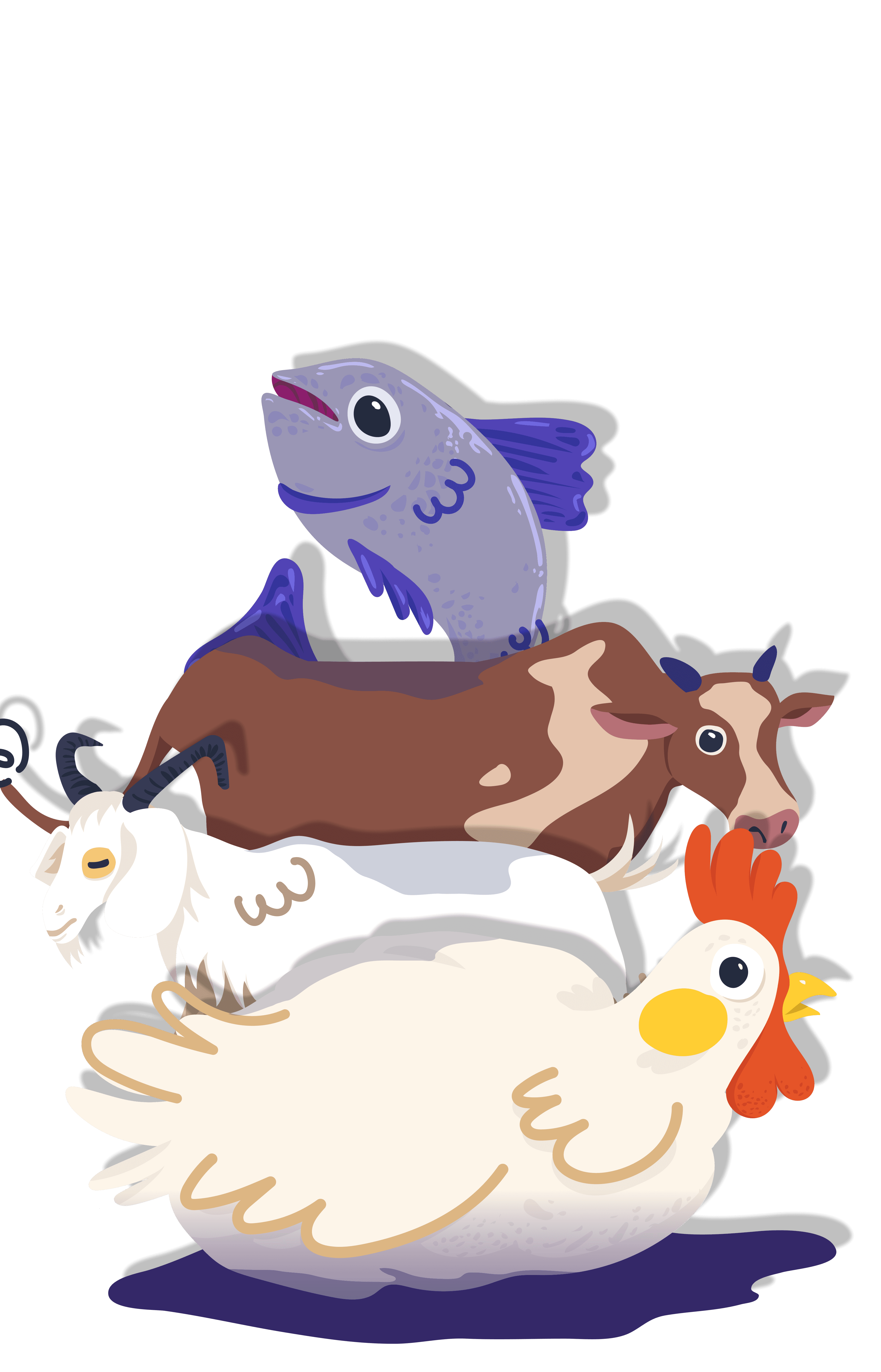
I used bright purples and pinks to make the infographic eye-catching and fun, appealing to a younger audience. The vibrant colors create an energetic feel and help the information stand out clearly.
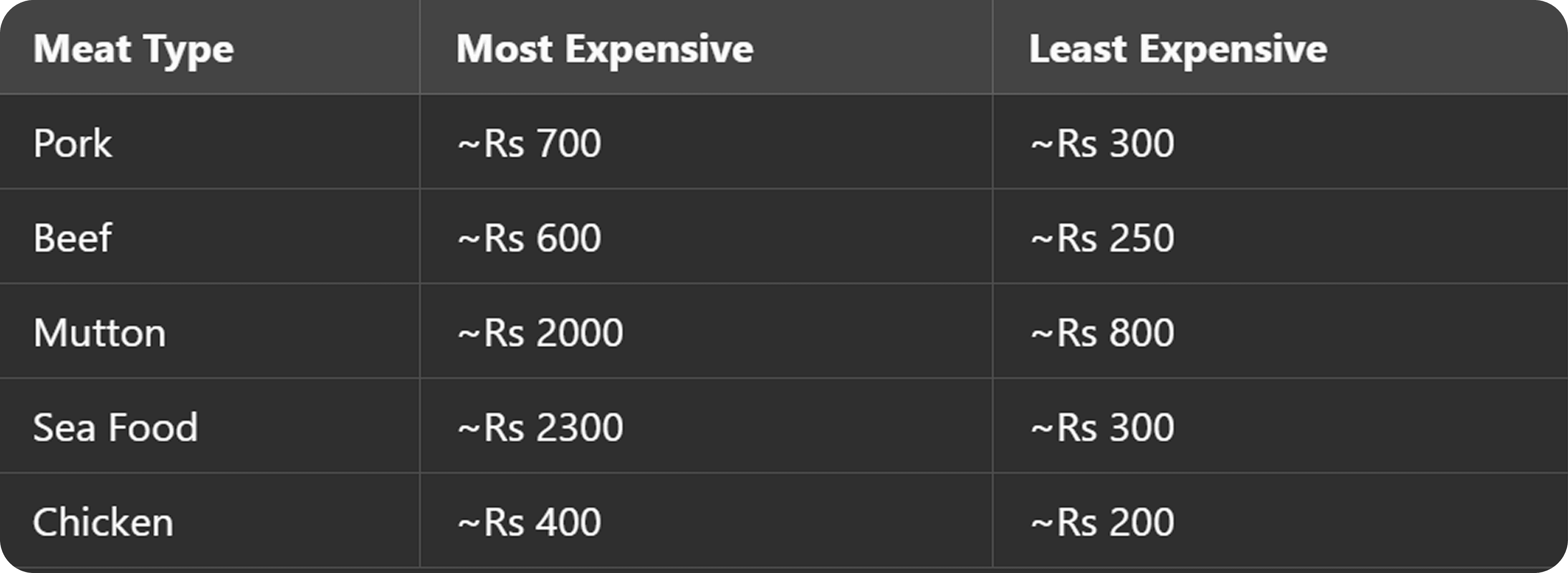
The final Infographic poster…
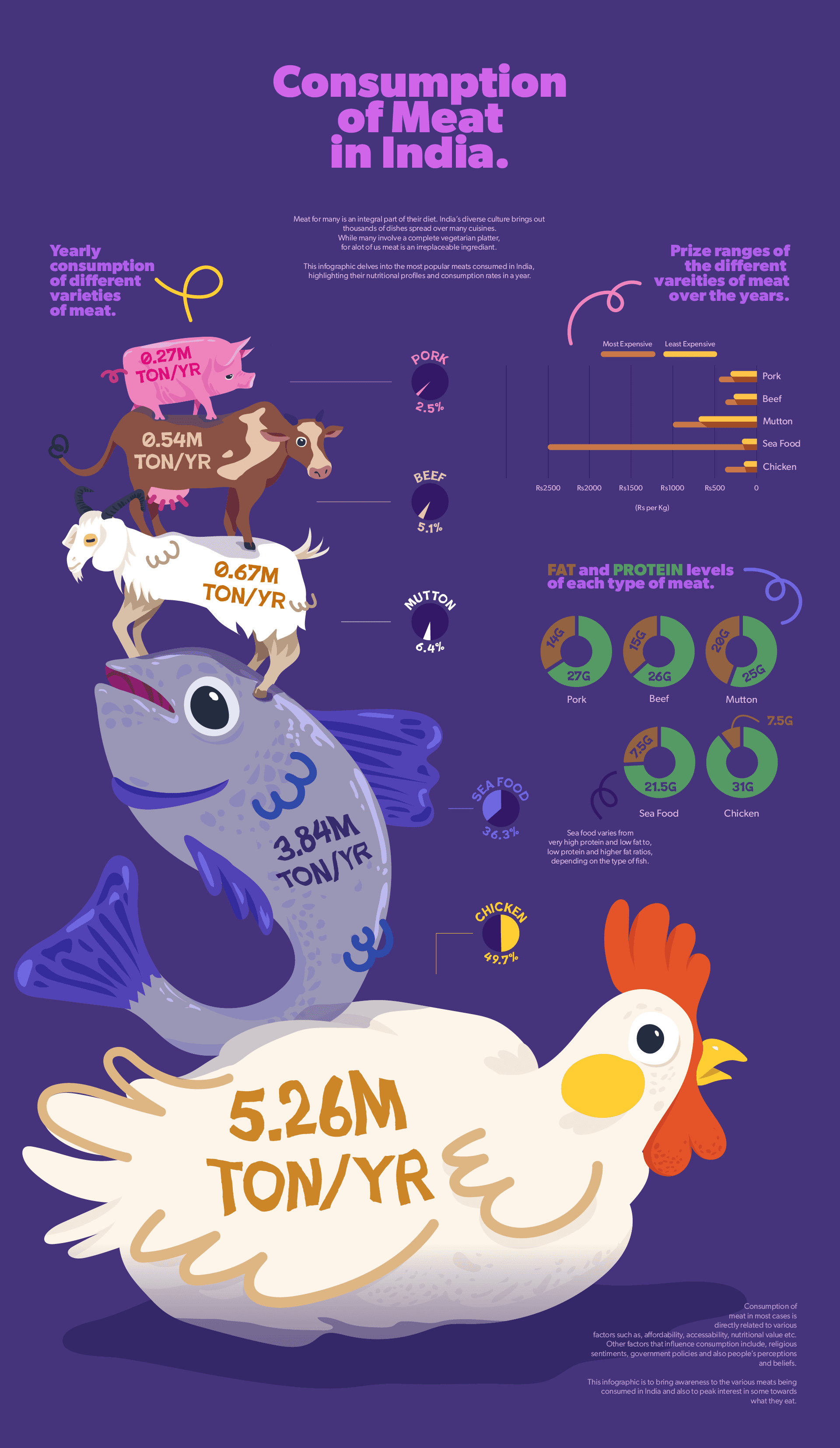
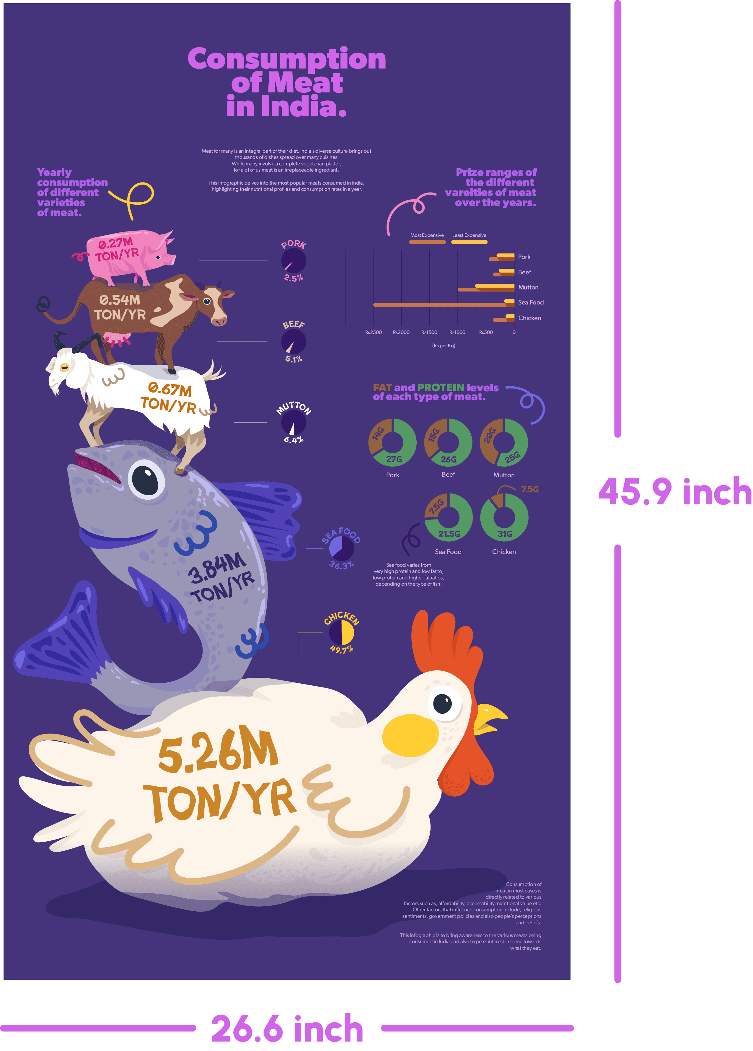
The size was chosen to make the infographic visually impactful and easy to read, even from a distance. It’s ideal for classrooms, children’s magazines, libraries, and public displays, ensuring that illustrations and text are clear and engaging for young audiences.